Chuvisco
This site's identity system, developed based on the new visual identity I created for myself and my experiments with Claude Code.
Context
Until recently, I used Adobe Portfolio to showcase my work, but when I started freelancing I realized it was time to complement my skills with Artificial Intelligence. Not generative AI, but rather AI applied to programming. To that end, I decided to create a new portfolio hosted on Netlify and with its own domain, featuring more focused case studies, with the help of Claude Code. The name "Chuvisco" comes from the static noise on CRT TVs, the same texture replicated by the site's filter.
CRT
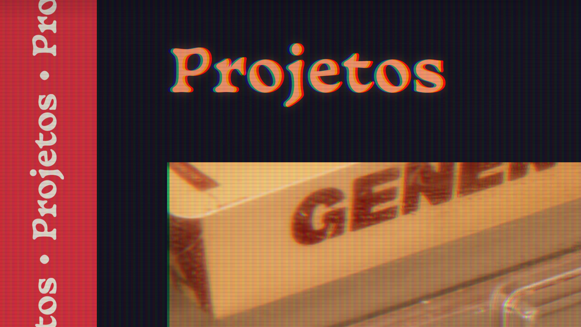
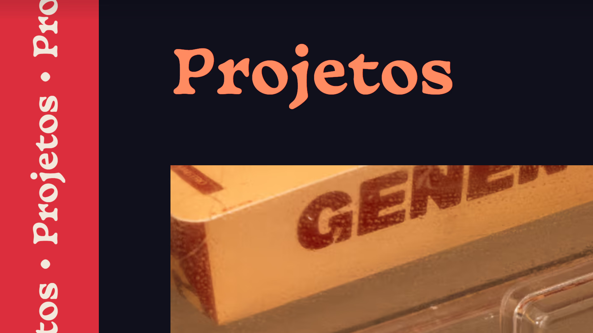
CRT TVs, often referred to as "tube TVs" here in Brazil, were the standard devices around the time I was born, spanning the late 90s and early 2000s. Visual artifacts produced by these TVs included chromatic aberration (a misalignment of RGB channels, creating colored fringes along the edges of elements), scanlines (horizontal lines that give the impression of thin, darker stripes across the screen), bloom (brightness bleeding from bright elements into their surroundings, creating a halo), and vignetting (since tube TVs aren't flat, the corners tend to appear darker than the center of the screen).
This effect underwent various tests in another personal project of mine before being refined and implemented in this website project. It can be toggled off at any time using a button at the corner of the screen.
Stickers
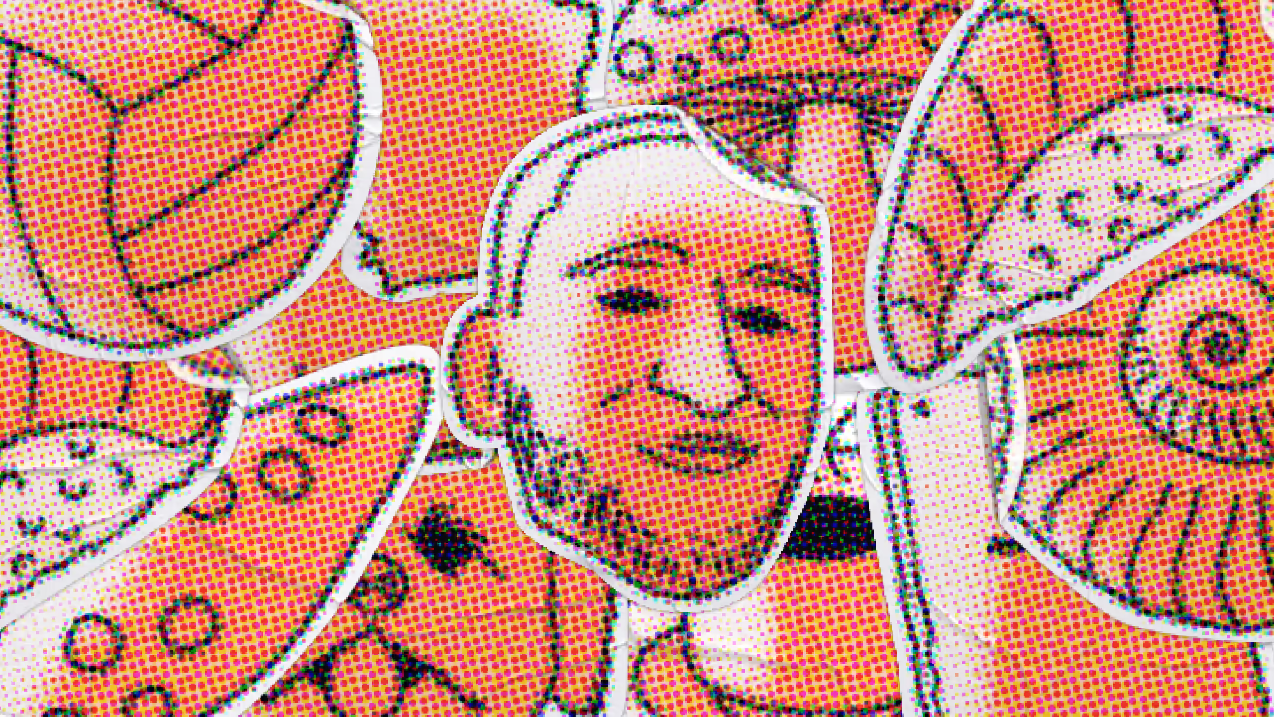
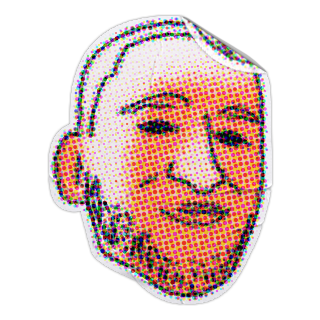
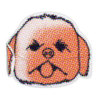
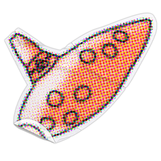
The stickers represent my manual intervention over the digital image, my personality expressed through my hobbies and tastes. They are intended to appear as if "stuck" onto the TV glass, so they remain unaffected by the CRT filter. As you drag them, you can see the light hitting them differently depending on their position on the screen.
This layer of stickers is not present on mobile, a deliberate choice to keep the reading fast and non-obtrusive. On mobile, the stickers only appear on this page to demonstrate the effect.
On the rest of the site, this layer is exclusive to desktop, a deliberate decision to keep the mobile reading experience light and non-obtrusive. Feel free to come back later on a larger screen to see the effect and interact with the elements!
You can drag and drop these stickers!
You can touch and drag these stickers!
Process
The portfolio building process began with the intention of refreshing my visual identity. I started with the standard elements of any identity (logo, typography, color palette, textures, and graphic elements) which led me to the design system and the website structure. Once the foundation was in place, other elements came into play, such as the custom pixel-art cursor (subtle yet effective in conveying the retro vibe), interactions with the stickers and the logo on the homepage, the gradient sidebar, among other details.
Working with AI
Claude Code joined this project to complement my skills, writing the website's code based on my ideas and prompts. I wrote all the texts myself using a master document that I updated throughout the process, and the AI replaced them in the code.
Along the project, I asked questions about how to host the site, the best coding practices, and other matters outside my usual expertise, always asking for explanations so I would finish the portfolio with a better understanding of programming than when I started. It also helped me identify bugs, make the site responsive, reduce file sizes and generally ensure the code was clean and straightforward.